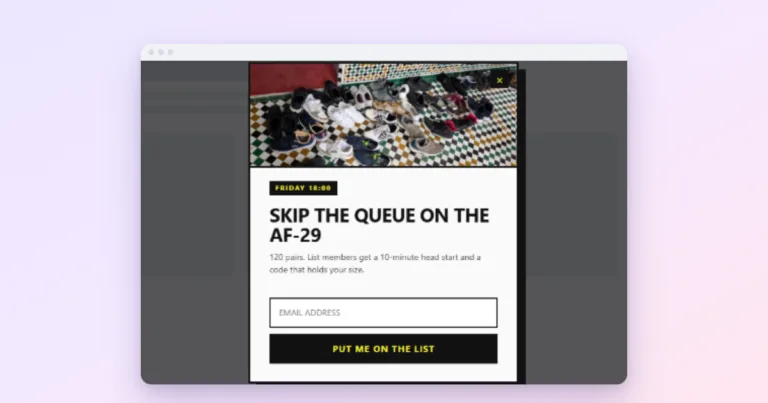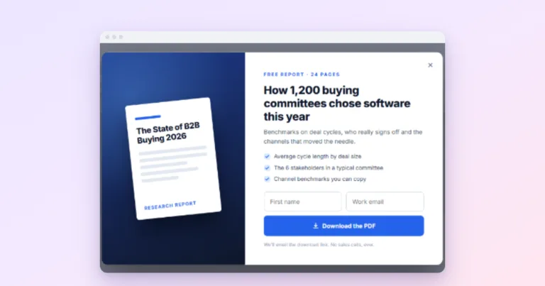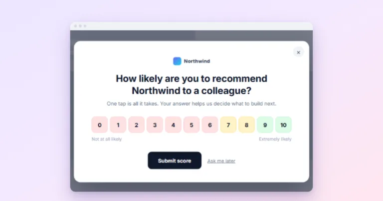


Mobile Popups That Do Not Annoy Visitors or Google
Small, easy to close and well timed: mobile popups that keep visitors and Google's rules happy.
 Wahiduz Zaman
Oct 22, 2026
4 min read
Free Pro
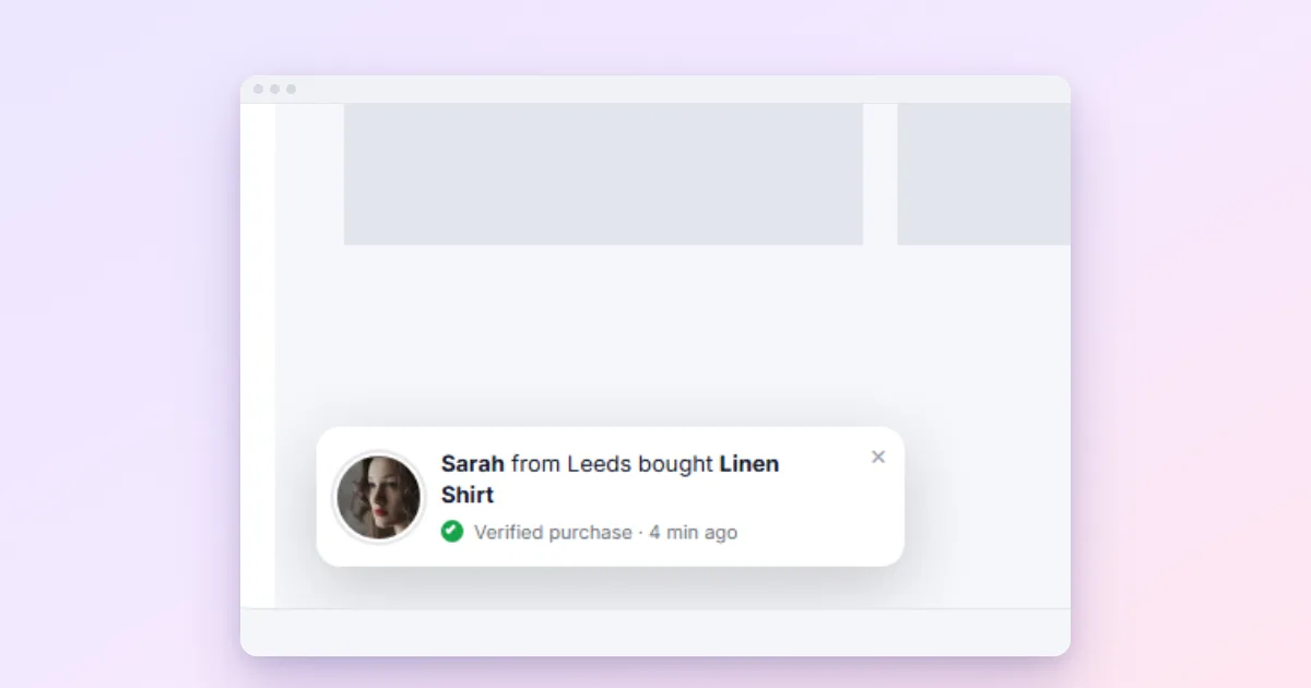
On phones, make popups smaller, later and easier to close than on desktop. Five rules cover most of it: never cover the page on arrival, keep the popup under about half the screen, make the close button big, ask for one field, and use a bar or an inline box where a desktop site would use a centred popup.
Most visits now happen on a phone, and phones are where popups do the most damage. A box that looks modest on a laptop fills the entire screen of a phone; a close button that is easy to click is fiddly to tap; and Google pays particular attention to what mobile visitors see when they arrive from search. Getting mobile right is worth it: in Omnisend’s 2025 data, popups shown on mobile converted at 2.2%, while desktop-only popups converted at 1.4%.
1. Do not cover the page on arrival
The single most important rule. Google’s guidance says pages that show a popup covering the main content “immediately after the user navigates to a page from the search results” may rank lower. Give mobile visitors time to see what they came for: a delay of several seconds, a scroll trigger, or a click. See are popups bad for SEO.
2. Keep it small, or make full screen comfortable
Two approaches work on phones:
- Small: a compact popup with a short heading and one field, taking up well under the full screen.
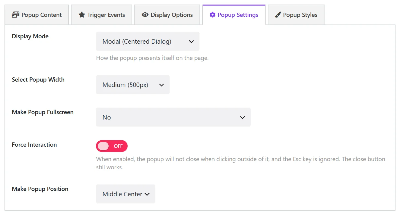
- Full screen, on purpose: for a form someone opened themselves (a contact form, a booking request), full screen is more comfortable than a cramped box. Wing Popup’s Make Popup Fullscreen can apply only to small screens (On Small Devices, 576px and below), so desktop keeps a normal popup.
What does not work is a big promotional popup that happens to fill the phone screen by accident.
Popups with an image beside the text need one more thought. In Wing Popup the image and text sit side by side only while the popup itself is at least 520 pixels wide; below that they stack, image on top. We based it on the popup’s width rather than the screen’s, because a small corner popup on a big desktop screen is just as cramped as a phone.
3. Make closing easy
- A close button large enough to tap with a thumb, in a corner the thumb can reach.
- Tapping outside the popup should close it (leave Force Interaction off for promotional popups).
- A visible “No thanks” text link under the button.
Only legally required gates, such as an age gate, should be hard to dismiss.
4. Ask for less
Typing on a phone is slow. One field (the email) is the maximum for an automatic mobile popup. If you need more details, ask on a second step or a later page. Short copy matters too: the heading should fit on two lines of a small screen.
5. Use bars and inline boxes
The formats Google recommends for mobile are banners that take “only a small fraction of the screen”. In practice:
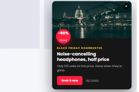
- A floating bar at the top or bottom with the offer or code (Wing Popup Pro).
- A slide-in panel in a corner for gentle prompts (Pro).
- An inline popup inside the article, which covers nothing at all (free).
The best setup: two versions of one offer
The cleanest way to treat phones differently is two popups for the same offer:
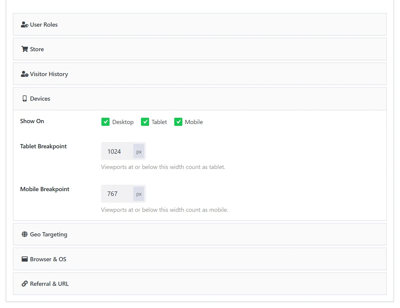
- A normal popup with Display Options → Devices set to Desktop (and tablet, if you like).
- A slim bar or inline box with Devices set to Mobile.
Device targeting is part of Wing Popup Pro’s audience rules. Pro’s Responsive style panel also sets smaller heading sizes and padding below a breakpoint (767 px by default), for popups that should simply shrink.
Mobile triggers
- Exit intent follows the mouse, so it does not work on phones. Combine it with a scroll or inactivity trigger for mobile visitors (Pro).
- Hover does not exist on touch screens. Pair any hover trigger with a click trigger on the same element.
- Scroll is the best mobile signal: someone halfway down an article is reading it.
Test on a real phone
Browser “device mode” on a laptop is a good start, not the end. Open your site on an actual phone, in a private tab, with a slow connection if you can. Check that the popup appears when you expect, that the text is readable without zooming, and that you can close it with one tap.
Frequently asked questions
Should I hide popups on mobile completely?
Not necessarily. Mobile popups convert well when they are small and well timed. Hide the ones that only make sense on desktop, and give phones a lighter version.
Is a full-screen popup on mobile always bad?
No. A full-screen form the visitor opened by tapping a button is comfortable. A full-screen promotion that appears by itself on arrival is the risky kind.
Which mobile features are free?
Delays, click triggers, popup width, full screen on small devices only, inline popups and frequency rules are free. Device targeting, bars, slide-ins, scroll triggers and responsive style controls are Pro.