

Popup Copywriting: Headlines and Buttons That Convert
Headlines, body text, buttons and the "no thanks" link: formulas and 30 examples.
 Wahiduz Zaman
Oct 25, 2026
5 min read
Free
A popup has about three seconds to explain itself. In that time the visitor reads the headline, glances at the button, and decides whether this is something for them or something in their way. So popup copy is mostly about cutting: one benefit, said plainly, with a button that tells people what happens when they click.
This post goes through each piece of text a popup has, gives a few formulas that reliably produce a decent first draft, and ends with 30 headline and button pairs you can adapt.
The six pieces of text in a popup
- Headline. The only text everyone reads. It carries the benefit.
- Supporting line. One or two sentences that make the benefit concrete or remove a doubt.
- Field placeholder. What to type, in plain words: “Your email address”.
- Button. What happens when they click.
- The way out. A close button, and often a “No thanks” link.
- Fine print and the follow-up. How often you email, the privacy link, and the message they see after saying yes.
Headlines: lead with what they get
Most weak headlines describe the popup instead of the benefit: “Subscribe to our newsletter”, “Special offer”, “Don’t miss out”. The visitor has to work out why they should care. A strong headline answers that before they ask.
Three formulas cover most popups:
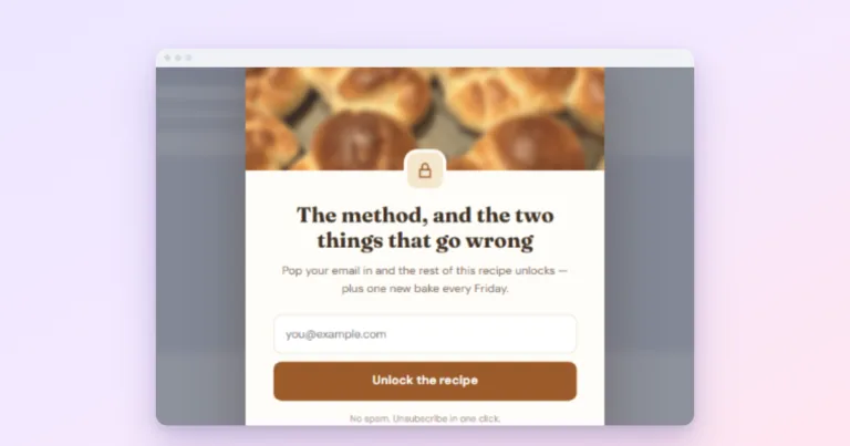
- [Thing] + [when or how often]: “One 20-minute recipe every Friday.”
- [Result] + [without the pain]: “Plan a week of dinners without the Sunday stress.”
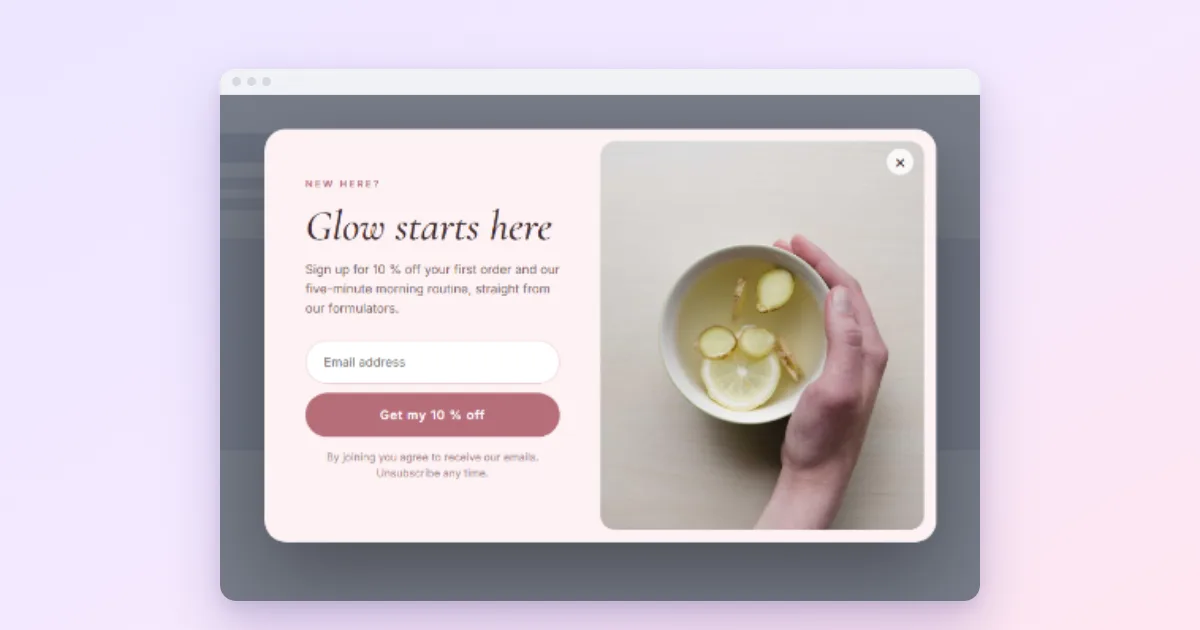
- [Offer] + [condition]: “10% off your first order, today only.”
Keep it under about ten words, so it fits on two lines of a phone screen. Read it aloud: if it sounds like something a person would say across a counter, it will work better than something that sounds like a banner ad.
The supporting line: make it concrete, answer the doubt
Use the line under the headline for whichever matters more for your offer:
- Detail: “Quick weeknight dinners, each tested in a real kitchen.”
- Reassurance: “One email a week. Unsubscribe with one click.”
- Proof: a real, current fact about you, such as how long you have been publishing. Never a number you cannot back up.
One or two sentences. A popup is not the place for a paragraph.
Buttons: say what happens
“Submit”, “Sign up” and “Subscribe” describe the action. Better buttons describe the result: “Send me the recipes”, “Get my 10% code”, “Unlock the checklist”. Writing the button in the visitor’s voice (“my”, “me”) reads naturally because it is the visitor who clicks it.
Two checks for every button:
- Does it repeat the benefit from the headline? It should.
- Would it still make sense if it were the only text the visitor read? Many people read the button first.
The way out: polite and easy
A visible close button and a plain “No thanks” link are part of the copy, because they tell visitors they are being asked, not cornered. Keep the decline neutral. “No thanks, I’ll pay full price” sounds clever in a meeting and makes the brand sound petty on the page; the practice has a name, confirmshaming.
Fine print and the follow-up message
Under the form, one short line: how often you email and a link to your privacy policy. If you use a consent checkbox, say exactly what people agree to (“Email me the weekly recipe. I can unsubscribe at any time.”).
The follow-up message, shown after a successful signup, is the most-read text in the popup by the people who matter most, and the one most often left as “Thank you!”. Use it: confirm what happens next (“Check your inbox to confirm, then the checklist is on its way”), or hand over the reward right there. In Wing Popup the follow-up can reveal a discount code with a copy button, so “Here’s your code” is followed by the code itself.
30 headline and button pairs
| Popup | Headline | Button |
|---|---|---|
| Newsletter | One 20-minute recipe every Friday | Send me the recipes |
| Newsletter | The week’s best design links, in five minutes | Get Friday’s list |
| Newsletter | New posts on WordPress speed, twice a month | Email me new posts |
| Newsletter | Garden jobs for this month, every month | Get the monthly list |
| Newsletter | Learn one Spanish phrase a day | Start tomorrow |
| Welcome offer | 10% off your first order | Get my 10% code |
| Welcome offer | Free shipping on your first order | Claim free shipping |
| Welcome offer | New here? Your first coffee is on us | Send my voucher |
| Welcome offer | New drops 24 hours before everyone else | Get early access |
| Welcome offer | A free sample with your first order | Choose my sample |
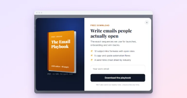
| Lead magnet | The 12-point checklist we use before every launch | Send me the checklist |
| Lead magnet | A 4-week meal plan, ready to print | Get the meal plan |
| Lead magnet | Our budget spreadsheet, ready to copy | Copy the spreadsheet |
| Lead magnet | 5 days to a cleaner inbox | Start lesson 1 |
| Lead magnet | Which plan fits you? 3 questions | Take the quiz |
| Announcement | 20% off everything until Sunday | Shop the sale |
| Announcement | Version 4 is here: twice as fast | See what’s new |
| Announcement | Order by 14 December for Christmas delivery | Shop gifts |
| Announcement | We’re closed 24 to 26 December | See opening hours |
| Announcement | Free live demo, Thursday 3 pm | Save my seat |
| Before you go | Your cart is saved. Want a reminder? | Email my cart |
| Before you go | Free returns for 30 days, no questions | Back to my order |
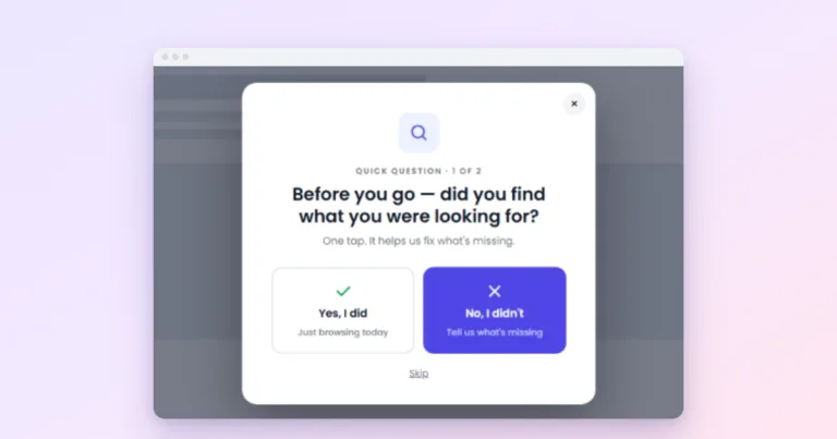
| Before you go | Did you find what you were looking for? | Yes / Not quite |
| Before you go | Get the next article by email | Email me the next one |
| Before you go | Questions before you decide? | Ask us |
| Contact or quote | Tell us about your project | Get my quote |
| Contact or quote | Questions? We reply within one business day | Send my question |
| Contact or quote | Book a free 15-minute call | Pick a time |
| Contact or quote | Not sure about the size? Ask us | Ask about sizing |
| Contact or quote | Prefer a callback? | Call me back |
Each of these only works if it is true for your site. “We reply within one business day” is a promise, and a popup that breaks it does more harm than one that says nothing.
Three before-and-after rewrites
| Before | After | What changed |
|---|---|---|
| “Subscribe to our newsletter” / Submit | “One recipe every Friday” / Send me the recipes | Benefit and schedule instead of a request |
| “Wait! Don’t go!” / Get offer | “Free shipping on this order, today” / Claim free shipping | Says what the offer is |
| “Get in touch” / Send | “Questions? We reply within a day” / Send my question | Removes the doubt (will anyone answer?) |
Before you publish
- Read the headline alone. Does it say what the visitor gets?
- Read the button alone. Does it say what happens?
- Is every promise (schedule, reply time, discount) true?
- Does the whole popup fit a phone screen without scrolling?
- Is the way out visible and polite?
Then measure it. Copy is the easiest part of a popup to change, which makes it the natural thing to A/B test, one change at a time; see A/B testing popups. For what to offer in the first place, see lead magnet ideas.