


Dark mode colours and images
Choose a dark colour preset or your own colours, darken the scrollbar, and adjust how images look in dark mode.
Dark mode is more than a black background. Wing Suite lets you pick the whole dark palette, from a ready-made preset or colour by colour, and tone images down so they do not glare on a dark page.
Colour settings#
Go to Wing Suite → Dark Mode → Color Settings.
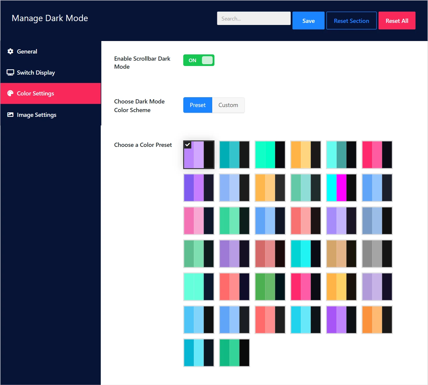
| Field | What it does |
|---|---|
| Enable Scrollbar Dark Mode | Darkens the browser's scrollbar too, so a bright bar does not sit beside a dark page. On by default. |
| Choose Dark Mode Color Scheme | Preset to pick a ready-made palette, Custom to set every colour yourself. |
Presets#
With Preset selected, Choose a Color Preset shows the palettes. Each swatch previews a preset's accent colours on its dark background. Click one to select it, then click Save.
There are presets for most tastes: neutral greys and near-blacks, deep blues and purples, warm browns, and high-contrast neon styles. Pick one whose accent colour is close to your brand colour, save, and look at your site in dark mode. Trying three or four takes a minute.
Custom colours#
With Custom selected, four groups of colours appear.
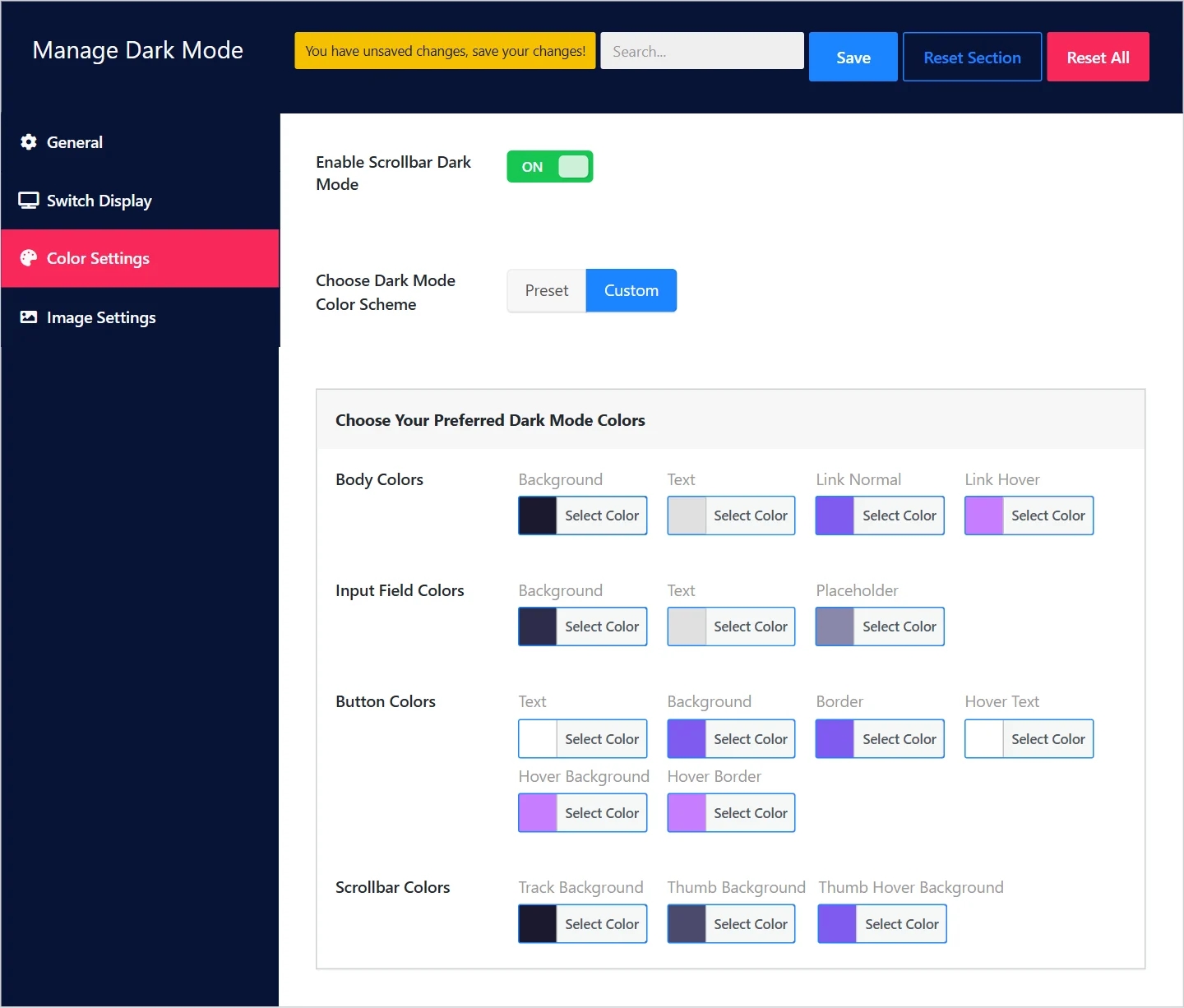
| Group | Colours |
|---|---|
| Body Colors | Background, Text, Link Normal, Link Hover |
| Input Field Colors | Background, Text, Placeholder |
| Button Colors | Text, Background, Border, and the same three on hover |
| Scrollbar Colors | Track Background, Thumb Background, Thumb Hover Background |
Click a colour's Select Color button to open the picker. The fields start with the values of a built-in preset, so you can adjust a few colours and leave the rest.
Choosing good dark colours#
- Avoid pure black and pure white. A very dark grey or navy background with slightly off-white text is easier on the eyes than
#000000with#ffffff. - Check the contrast of body text and links against the background. Text that looked fine on white may need to be lighter.
- Use your brand colour for links and buttons, lightened a little if it is dark, so it stands out on the dark background.
- Look at a form. Inputs and placeholders are the parts most often forgotten.
Image settings#
Bright photos can look harsh on a dark page. Go to Wing Suite → Dark Mode → Image Settings; the Image Filter tab changes how images are shown while dark mode is on. Light mode is not affected.
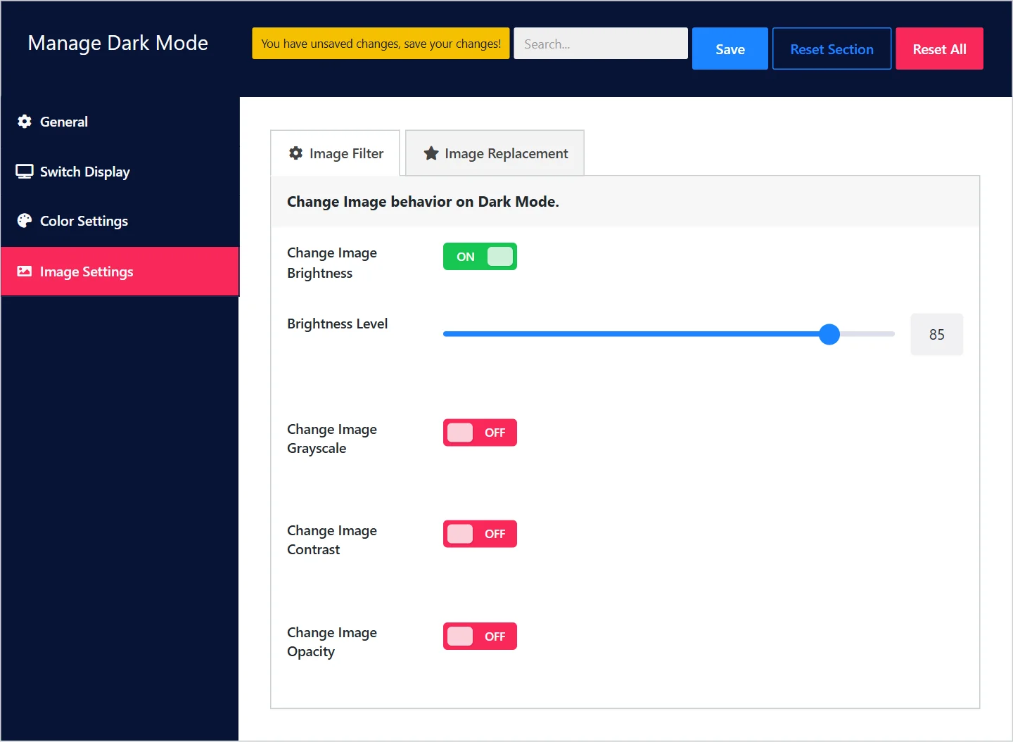
Each filter has a switch and, once on, a Level slider:
| Filter | Effect in dark mode |
|---|---|
| Change Image Brightness | Dims images. The most useful one: a level of 80 to 90 takes the glare off without making photos look dull. |
| Change Image Grayscale | Removes colour. For a deliberately monochrome look. |
| Change Image Contrast | Raises or lowers the difference between light and dark areas. |
| Change Image Opacity | Makes images slightly see-through, so the dark background softens them. |
Start with brightness alone. Filters apply to every image on the page, so check a page with your logo and product photos before settling on a level.
The Image Replacement tab, for swapping an image for a different one in dark mode, is planned for a later release.
After changing colours#
Click Save, then reload your site in dark mode. If you use a caching plugin, clear its cache so visitors get the new colours.
Did this not answer your question?
Send us what you are trying to do and we will help, and improve this page.