


Display mode, size and position
Show a popup as a modal, inline in the page, as a floating bar or as a slide-in panel, and set its width, fullscreen behavior and position.
The Popup Settings tab decides how a popup presents itself: its display mode, how wide it is, whether it fills the screen and where it sits.
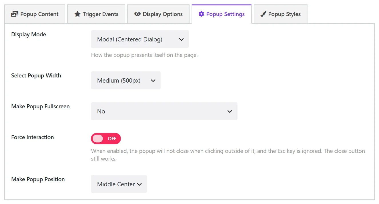
Display Mode#
| Mode | What it is | |
|---|---|---|
| Modal (Centered Dialog) | The classic popup: a box over a dimmed page. | Free |
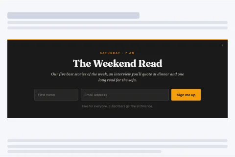
| Inline (Embedded In The Page) | The popup's content placed inside the page itself, like a banner in an article. Nothing covers the page. | Free |
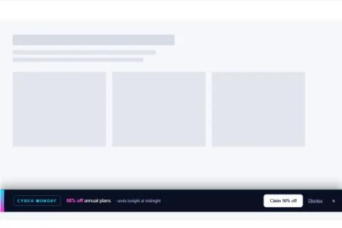
| Floating Bar | A strip fixed to the top or bottom edge of the window. | Pro |
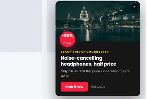
| Slide-in Panel | A panel that slides in from the left or right edge of the window. | Pro |
Floating bar
Slide-in panel
Inline
Without Wing Popup Pro, a popup set to Floating Bar or Slide-in Panel falls back to a modal.
Mode options#
| Field | Shown for | What it does |
|---|---|---|
| Position | Floating Bar | Top or Bottom of the window. |
| Position | Slide-in Panel | The Left or Right edge. |
| Insert Into Element | Inline | A CSS selector for the element the popup is placed inside, for example .entry-content. Leave empty to keep it where it is printed, at the end of the page. |
Choosing a mode#
- Modal for messages that deserve full attention: an offer, a signup, a gate.
- Bar for messages that should stay visible without interrupting: a coupon code, a countdown, a cookie notice, free-shipping news.
- Slide-in for gentle prompts while the visitor keeps reading: a chat invitation, a recent sale, a newsletter nudge.
- Inline for content that belongs to the page: a signup box inside an article.
An inline popup is part of the page flow from the start. Triggers still decide when it becomes visible, but rules that are answered only after the page has loaded for each visitor (user role and geo) are not applied to it.
Width#
Select Popup Width sets how wide a modal is.
| Choice | Width |
|---|---|
| Small | 300 px |
| Medium | 500 px (default) |
| Large | 800 px |
| Extra large | 1140 px |
| Custom Width | Your own value and unit in Popup Custom Width |
On screens narrower than the chosen width the popup shrinks to fit.
Fullscreen#
Make Popup Fullscreen lets a modal cover the whole window:
| Choice | Result |
|---|---|
| No | Never. The default. |
| Always | On every screen size. |
| On Small / Medium / Large / Extra large devices | Only at or below 576, 768, 992, 1200 or 1400 px. |
On Small Devices is a good choice for forms: a normal popup on desktop, a comfortable full screen on phones.
Force Interaction#
When Force Interaction is on, the popup does not close when the visitor clicks outside it, and the Escape key is ignored. The close button still works. Use it for popups that should be answered rather than brushed away. To remove the close button as well, see Closing behavior.
Position#
Make Popup Position places a modal in one of nine spots: top, middle or bottom, each left, center or right. Middle Center is the default.
A small modal in a bottom corner behaves much like a slide-in and is available in the free plugin.
Did this not answer your question?
Send us what you are trying to do and we will help, and improve this page.