


Popup styles
Style a popup's close button, container, overlay, typography and buttons, and set different values for small screens.
The Popup Styles tab holds a popup's visual settings, grouped in panels. Click a panel's title to open it.
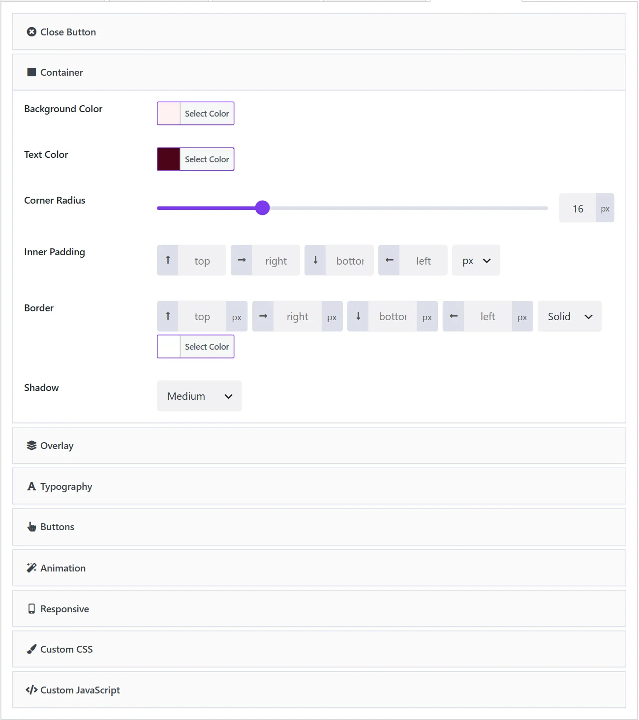
| Panel | What it styles | |
|---|---|---|
| Close Button | The close button's colours, or hide it | Free |
| Container | Background, text colour, corners, padding, border, shadow | Pro |
| Overlay | The dimmed page behind the popup | Pro |
| Typography | Heading and body text sizes, weight, colour, alignment | Pro |
| Buttons | The call-to-action and dismiss buttons | Pro |
| Animation | How the popup enters and leaves. See Animations | Pro |
| Responsive | Different values for small screens | Pro |
| Custom CSS | Your own CSS for this popup. See Custom CSS | Free |
| Custom JavaScript | Your own script for this popup. See Custom JavaScript | Pro |
Without the style panels, a popup takes its fonts and button styles from your theme, so it already matches your site. Popups inserted from the Popup Library keep their designed look in the free plugin too; the Pro panels are what let you change those values with controls rather than CSS.
Close Button#
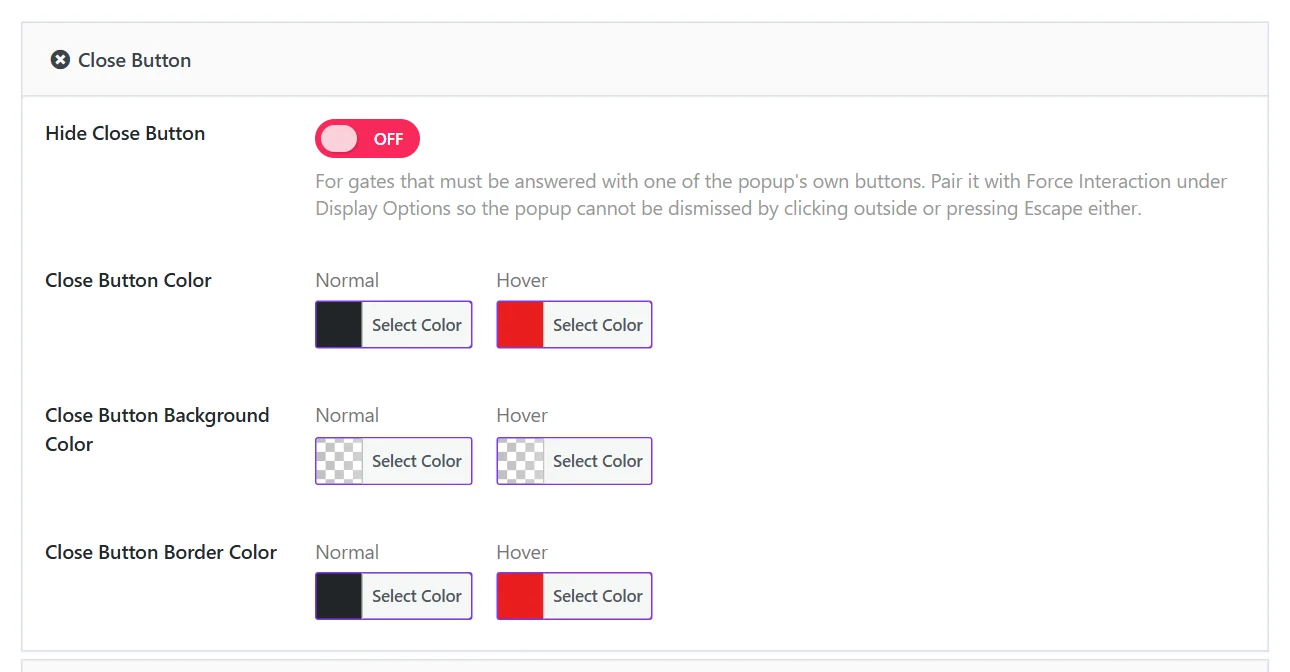
| Field | What it does |
|---|---|
| Hide Close Button | Removes the close button. Meant for gates that must be answered with the popup's own buttons; pair it with Force Interaction on the Popup Settings tab. |
| Close Button Color | The colour of the ×, normal and on hover. |
| Close Button Background Color | The button's background, normal and on hover. |
| Close Button Border Color | The button's border, normal and on hover. |
Container#
The popup's box.
| Field | What it does |
|---|---|
| Background Color | White by default. |
| Text Color | The colour of the body text. |
| Corner Radius | How round the corners are, in pixels. |
| Inner Padding | Space between the edge of the box and its content: top, right, bottom, left, with a unit. |
| Border | Width per side, style and colour. |
| Shadow | None, Subtle, Medium or Pronounced. |
Overlay#
The layer between the popup and the page.
| Field | What it does |
|---|---|
| Overlay Color | Black by default. |
| Overlay Opacity | 0 to 100. 50 by default. A higher value hides more of the page. |
| Background Blur | Blurs the page behind the overlay. 0 by default. |
Floating bars have no overlay, so these settings do not apply to them.
Typography#
| Field | What it does |
|---|---|
| Heading Size | In pixels. 24 by default. |
| Heading Weight | Normal, Medium, Semi Bold, Bold or Extra Bold. |
| Heading Color | Leave empty to use the text colour. |
| Body Text Size | In pixels. 16 by default. |
| Text Alignment | Left, Center or Right. |
The font family comes from your theme. To use another font in one popup, set it with Custom CSS.
Buttons#
| Field | What it does |
|---|---|
| CTA Background, CTA Text Color | The call-to-action button's colours, normal and on hover. |
| Button Radius, Button Text Size, Button Padding | Its shape and size. Leave the padding empty to keep your theme's. |
| Button Width | Fit content or Full width. Applies to both buttons. |
| Dismiss Background, Dismiss Text Color, Dismiss Border Color | The dismiss button's colours. |
| Dismiss Radius, Dismiss Text Size, Dismiss Padding | Its shape and size. Leave the padding empty to match the call-to-action button. |
Responsive#
Values that should differ on small screens. Anything left empty keeps the setting from the panels above.
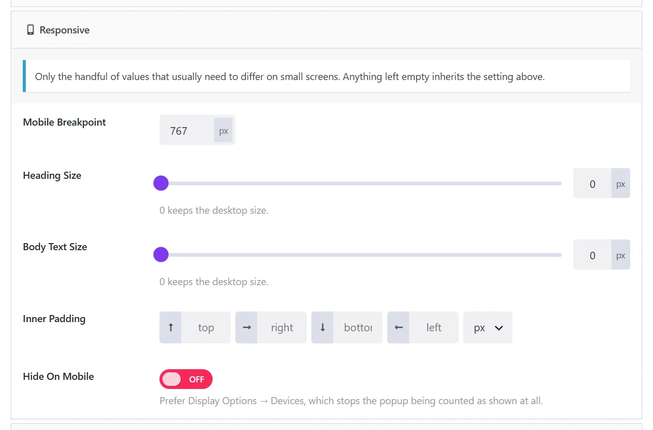
| Field | What it does |
|---|---|
| Mobile Breakpoint | Screens at or below this width use the values below. 767 px by default. |
| Heading Size, Body Text Size | 0 keeps the desktop size. |
| Inner Padding | Usually smaller on phones. |
| Hide On Mobile | Hides the popup on small screens. Prefer Display Options → Devices, which keeps the popup from being counted as shown at all. |
Form styles#
A form inside a popup has its own look, set on the form: Wing Popup → Forms → Appearance. See Form messages and appearance.
Did this not answer your question?
Send us what you are trying to do and we will help, and improve this page.