


Image and Content popup
Build a popup from an image, a heading, text, a call-to-action button and a dismiss button.
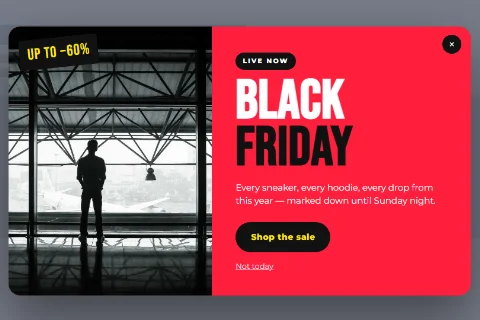
Image and Content is the general-purpose popup type: an image, a heading, a block of text and up to two buttons. Most announcement, offer and welcome popups are built with it.
Set it up#
- Go to Wing Popup → Popups and add or edit a popup.
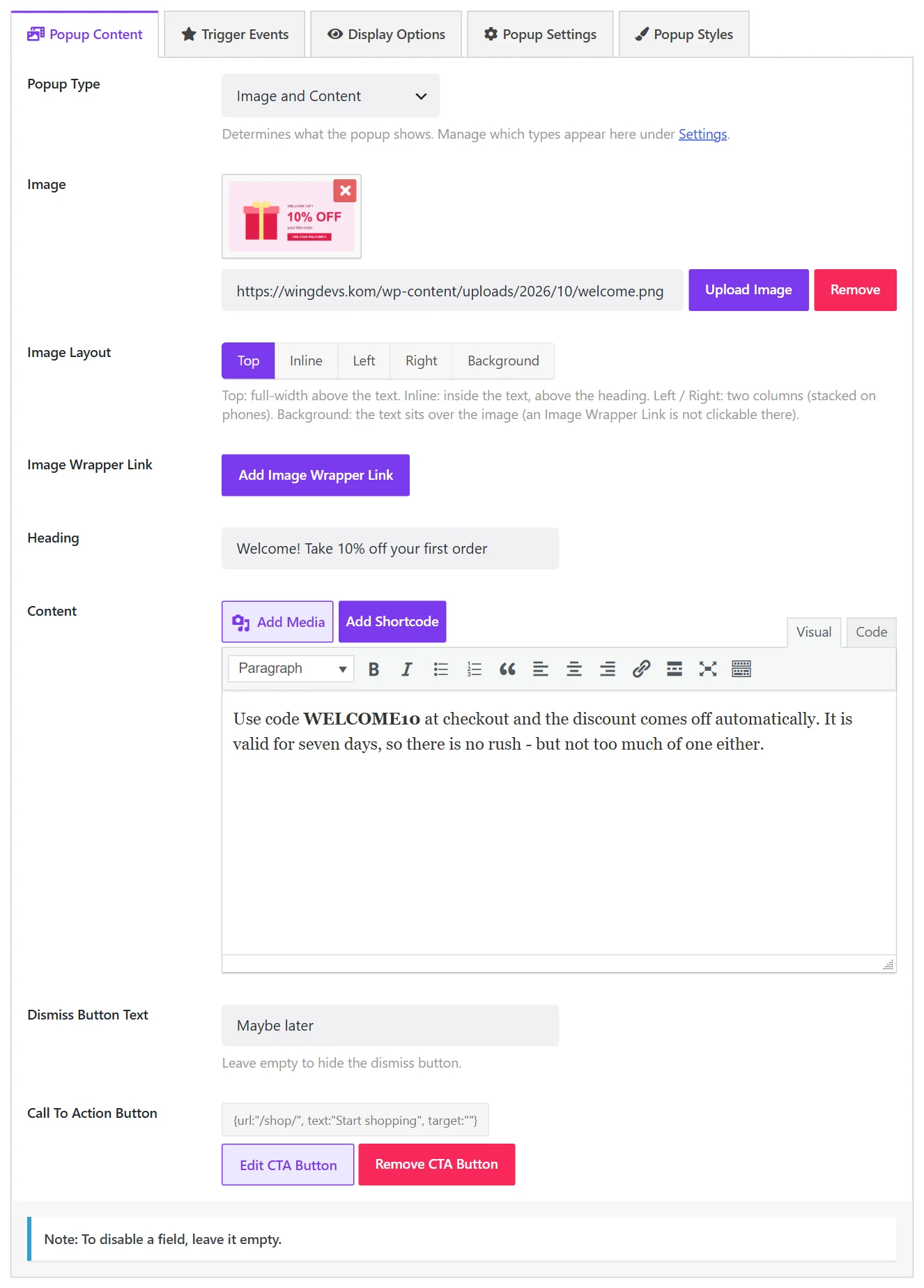
- On the Popup Content tab set Popup Type to Image and Content.
- Fill in the fields below and click Save.
The fields#
| Field | What it does |
|---|---|
| Image | The picture. Optional: a popup without an image shows text only. |
| Image Layout | Where the image sits: Top, Inline, Left, Right or Background. See Image layout. |
| Image Wrapper Link | Makes the image a link. |
| Heading | The popup's title. |
| Content | The body text. The editor supports formatting, links, lists, media and shortcodes. |
| Dismiss Button Text | The label of a second button that closes the popup, for example Maybe later. Leave empty for no dismiss button. |
| Call To Action Button | The main button: its link, its text and whether it opens in a new tab. |
To leave a part out, leave its field empty. A popup with only a heading and a button is perfectly valid.
Writing good popup content#
- One message. Say one thing and offer one action.
- A heading that stands alone. Many visitors read only the heading before deciding.
- A button that says what happens. Shop the sale beats Click here.
- An honest way out. A dismiss button with a neutral label is friendlier than one that shames the visitor.
Styling#
The popup's size and position are set on the Popup Settings tab. Colours, fonts and button styles are on the Popup Styles tab, and anything else can be done with Custom CSS.
Did this not answer your question?
Send us what you are trying to do and we will help, and improve this page.